


by James Lindenschmidt
Using room testing software to analyze a listening room has become a common practice over the past decade, even for non-professionals. Testing is a very useful tool to understand why our rooms sound the way they do and gives us a lot of information on how to improve the sound we experience in our rooms. Objective data, such as that generated by these software packages, is not accessible just through listening. Yes, we can hear differences between sounds, but listening (and perception in general) is fraught with challenges such as expectation bias and the placebo effect that make it difficult to discern exactly what’s happening. Testing allows us to understand our room’s sound more objectively.
![]() The most common acoustics testing software used today is Room EQ Wizard (REW), which is a powerful, multiplatform software package that is freely available. The basics of using REW and room testing have been well-covered elsewhere on our website; and explain how to set up REW, how to shoot your room, how to generate waterfall graphs, and how to interpret them. These are very important tests and concepts for anyone looking to improve their room. If you aren’t already familiar with these techniques then you should start there. These articles are concerned mostly with frequency and SPL, which are easy to understand for most audio folks since frequency response graphs are common specs for audio gear.
The most common acoustics testing software used today is Room EQ Wizard (REW), which is a powerful, multiplatform software package that is freely available. The basics of using REW and room testing have been well-covered elsewhere on our website; and explain how to set up REW, how to shoot your room, how to generate waterfall graphs, and how to interpret them. These are very important tests and concepts for anyone looking to improve their room. If you aren’t already familiar with these techniques then you should start there. These articles are concerned mostly with frequency and SPL, which are easy to understand for most audio folks since frequency response graphs are common specs for audio gear.
But a frequency response graph cannot on its own address an essential part of the audio experience: time. Sound travels through time, and the way we perceive sound changes through time. Both of these factors need to be included in any evaluation of how a room sounds.
Digging Deeper: ETC and the Impulse Window
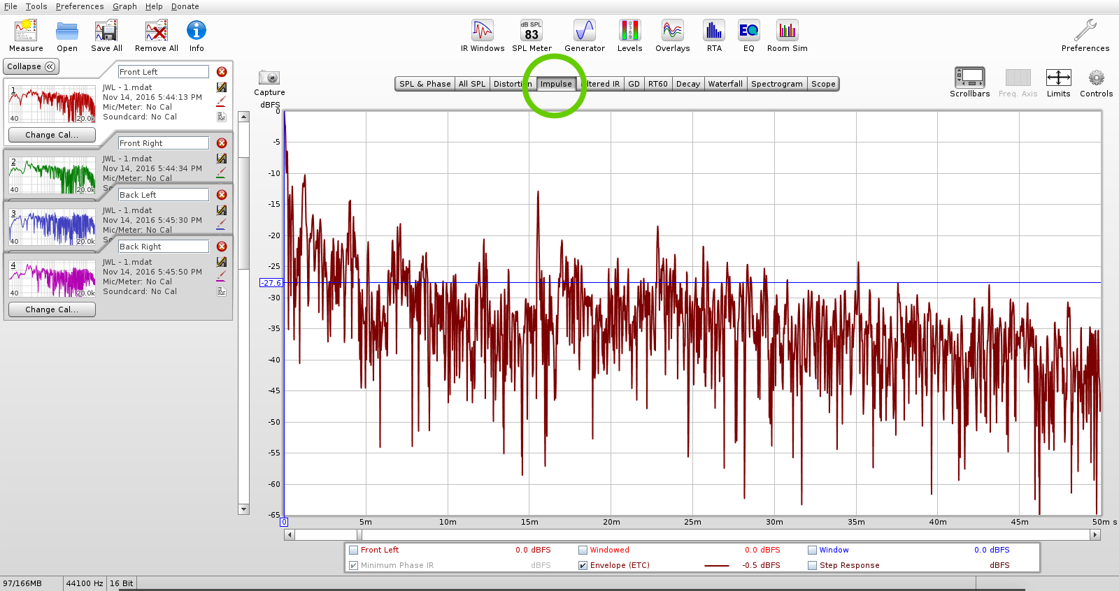
Sound never happens in an instant; by definition, sound is change over time. Room acoustics are dynamic, meaning the room’s effects on what we hear also are different over time. Our testing, therefore, should account for these changes over time. The most well-understood example of time-based audio testing is the waterfall graph, often used to find frequencies where the room “rings” in the bass response. But another REW window gives us another very useful graph involving the time domain: the Impulse window can show us an Energy-Time Curve (ETC) for our rooms. As its name implies, this is a graph of energy over time, as opposed to the energy over frequency graphs we are more accustomed to. By clicking on the “Impulse” tab, and checking the ETC curve box (and ONLY the ETC curve box), we can see this new kind of graph to help us interpret our test data:

This graph is quite different from a frequency response graph, mainly in that the X-axis (the bottom horizontal axis) is not frequency, but time. This graph, in other words, only shows us how much energy the sound has, but nothing else about the sound (such as frequency).
Note that each test within REW will have its own impulse response. It’s a good idea to test all speakers in the room independently, whether it’s a 2-channel or 7.1 system (or larger). This will give us multiple graphs, but each graph will be more readable and more accurate and it will tell us exactly how each speaker interacts with the room over the time domain individually.
For small room measurements, we are mostly interested in what happens in the early stages of psychoacoustic perception, under the precedence effect. Below a certain threshold, usually understood to be about 20-40ms, we cannot perceive similar sounds as echoes, or as being distinct from one another. Instead we perceive them as one sound, though the interaction between these sounds also produce audible effects. For instance, because of the masking phenomenon, we tend to not hear the softer of the two as a distinct echo with its own location, though its interaction with the direct sound (in the form of comb filtering) will be audible, and it can make this earlier sound also appear louder.
Once we get out to a person’s echo threshold, or the point at which we begin to perceive distinct echoes, then we will start to perceive them as two different sounds. There is some debate over where this transition happens; some say 20ms, some 30, 40, or even 100ms:
“The transition zone between the integrating effect for delays less than 35msec and the perception of delayed sound as discrete echo is gradual, and therefore, somewhat indefinite. Some peg the dividing line at a convenient 1/16 second (62msec), some at 80msec, and some at 100msec beyond which there is no question about the discreteness of the echo. In this book we will consider the first 30msec… the region of definite integration” (Everest, Master Handbook of Acoustics, 4th Edition, p 74).
The important point to remember is that there is a range, a gradual transition, from perceiving reflections as part of the direct sound, to perceiving reflections as distinct echoes. This precedence effect is one of the things we are testing for with the ETC curve, so it’s important to bear in mind.
If you haven’t done so, a listening experiment in a DAW (Digital Audio Workstation) adding echoes using a delay can be interesting and useful. Keep feedback to minimum (for just one echo), a 50% wet/dry mix, and start with the delay time at 0ms and slowly increase the delay out to 100ms. Listen to how you perceive the delay changes as you increase the delay time. Shorter delay times will start to produce audible artifacts, not unlike chorusing, phasing, or flanging, along with some comb filtering that can cause some frequencies to jump out and others to disappear. Gradually you will begin to hear distinct echoes, probably between 30-50ms.
For the purposes of our testing here, configuring your ETC graph (via the LIMITS window in REW) to show the first 50ms, as shown above, will give us what we need to know from the impulse curve.
Smooth spikes? What exactly are we looking at here?
The simplest way to think about an ETC graph is that every spike in response in the graph is a reflection coming from somewhere. We already know that controlling early reflections are very important to good sound, so this test is useful to show us how we’re doing on that front. It can also help determine where the reflections are coming from. Remember that sound takes time to travel; the speed of sound is 1126 feet per second, or 1.126 feet per millisecond. It’s useful to think of it, roughly, as 1 foot per millisecond.
For instance, take a look at figure 2:
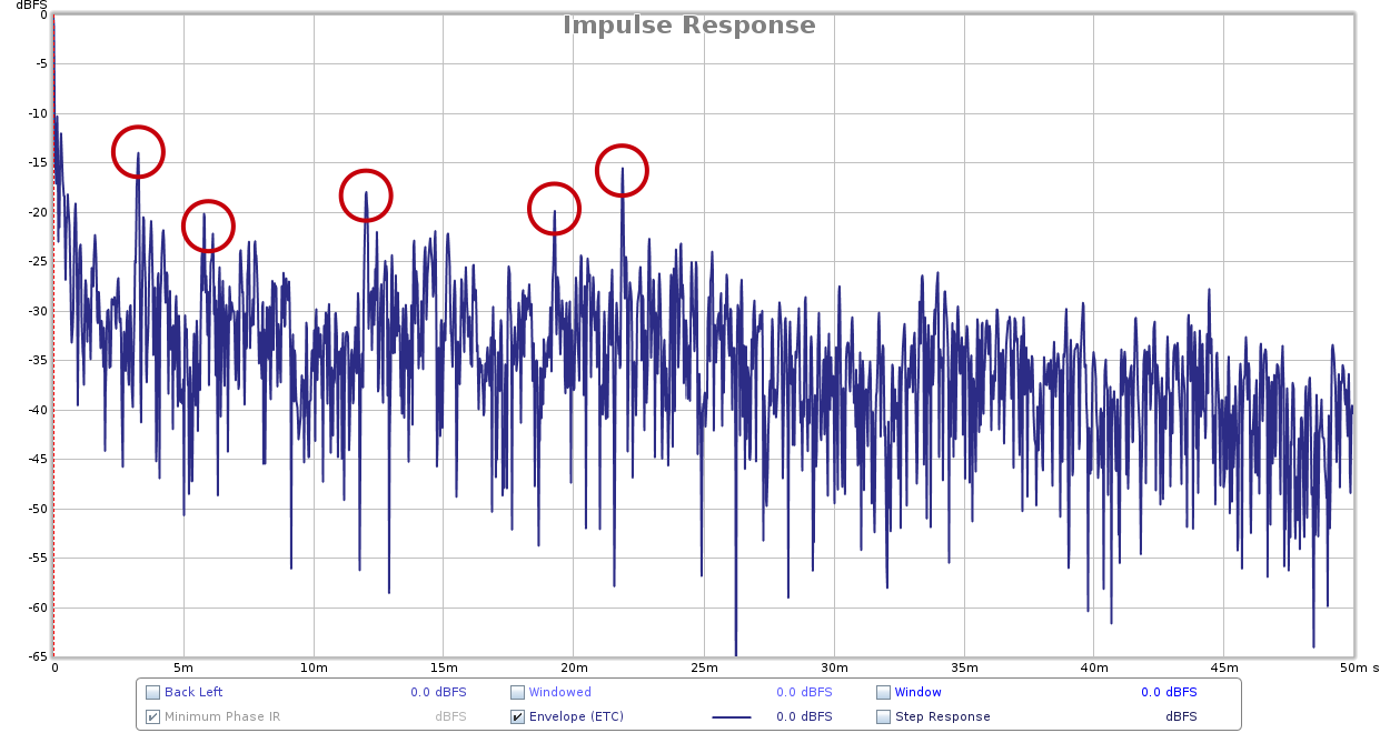
In this graph, you can see that the first spike occurs at about 3 milliseconds. This is where geometry can be quite helpful; we can calculate from this example that the sound traveled about 3.378 feet further than the direct sound from the speaker to the measurement microphone. This reflection is most likely coming from a reflective surface close to the speaker or the measuring microphone. In the case of this room, these extremely early reflections are the desk that the speakers are resting on. This is one reason why it is so important to have your desk setup optimized for audio work, both acoustically and ergonomically.
The three most important things we want to see in an ETC test are:
- A smooth decay of spikes. Each spike should be softer than the previous one, without any “ripples” where softer spikes precede louder ones in time. The above graph in Figure 2 is therefore NOT representative of a great room decay, since there are several spikes louder, at about 12, 19, and 22 ms, than previous spikes.
- Spikes softer within the echo threshold. Spikes within 0 (the initial transient) out to 20-40ms or so should be down by 10-20dB. Opinions vary on the exact numbers of this precedence effect, but at GIK, some of the better rooms we have seen will show them down by 15-20dB within 20ms. Rooms with these characteristics are less psychoacoustically jumbled, the stereo image is more distinct, with a more realistic soundstage and greater articulation and intelligibility during listening. Figure 2 does pretty well on this, since all of the spikes after 20ms are down 20dB except one, which is at 15dB.
- Graphs for all the speakers match, as closely as possible. They will never be exactly the same, but the closer they match the better. The more symmetrical the room is, the better the chance that the graphs for all speakers will match. We know all rooms will color the sound we hear to some degree, we just want to both minimize the coloration and make sure each speaker, if must be colored, will be colored in the same way. If our rooms are not symmetrical, then we can use various treatments to try to restore some acoustic symmetry to a physically asymmetrical room, and use the results of this test – along with critical listening to familiar music – to evaluate our progress.
Tweaks & refinements
Sometimes the ETC can be a little hard to read while we are trying to interpret our data, especially if we are comparing 2 curves. Luckily REW gives us some options to improve the intelligibility of the data in the graph. The main one to use is smoothing, which is useful to get a better idea of the overall shape of the curve, rather than the detail shown in an unsmoothed graph. By clicking on the Controls icon at the top right of REW above the graph, we can see the ETC smoothing, circled in red, and set to 0.2ms smoothing:

You can adjust the smoothing control until the overall shape of the ETC curve looks clearer, and you aren’t distracted by so many spikes.
Acoustic Treatment to the rescue!
The solution here is to use absorption at the reflection points. This early reflection management strategy should be familiar to a beginning student of acoustics, and is explained in detail in this video:
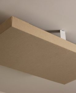
In addition to the beneficial effects described in this video – a better soundstage, more detailed stereo image, easier to hear accurately & make mix decisions, etc – absorption will also reduce or eliminate some of the spiking that occurs, smoothing out the decay of the room. Simple 2” absorption panels like the GIK 242 will give much of the effect we are looking for, though thicker panels such as the GIK 244 or GIK Monster Bass Trap will extend the absorption to lower frequencies. In small rooms, thicker panels at reflection points can be used quite effectively for a maximally accurate bass response.
When in doubt, ask for help
These techniques can help you deepen your understanding of what’s happening with your room. As always, we are happy to help you both interpret your test data, as well as recommend solutions with our patented GIK Acoustic treatments. Contact us for free acoustical room.

Designer Tips: The Significance of “Clouds” with Mike Major
When people reach out to us at GIK for acoustic advice, we never have any [...]
Jun
Designer Tips: The Importance of Coverage Area with James Lindenschmidt
The most important factor in acoustic treatment performance is coverage area. Or more specifically, the [...]
May
Designer Tips: Home Theaters and Acoustic Balance with John Dykstra
Without fail, one of the first things our clients say to us when we begin [...]
May
Black Friday Cyber Monday Sale 2021
[...]
Nov
GIK Acoustics Releases Stylish Vocal Isolation Booth
ATLANTA, GA (June 3, 2020) – We announced the debut of a new portable sound [...]
Aug
Photo Contest 2021 Extended!!
The GIK Acoustics Summer Giveaway Photo Contest 2021 invited customers to submit photos illustrating how [...]
Aug
GIK Giveaway Summer Photo Contest 2021
The GIK Acoustics Summer Giveaway Photo Contest 2021 invited customers to submit photos illustrating how [...]
Jun
Speaker Placement: How far from the wall should I place my speakers?
There’s a lot of confusion surrounding speaker placement. In truth, the optimal speaker setup is [...]
Mar